WFN Home Page
Workforce Now (WFN) is ADP’s most valuable product, generating nearly 12 billion in revenue a year. Even small changes in WFN can have major impacts and require a lot of due diligence. Redesigning the home page was one of the most significant changes in a decade. Here is how I managed it
The problem
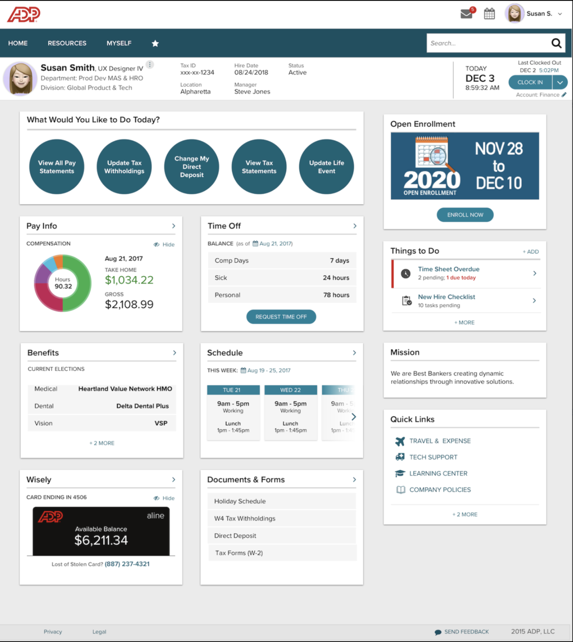
The Workforce Now (WFN) home page faced significant design and usability challenges, compounded by clients customizing their home pages without UX guidance. This led to frequent customer complaints, high support call volumes, and issues that were difficult to resolve due to the customizable setup. On top of that, ADP was losing potential customers to competitors with better-designed and more user-friendly products. To address this, ADP leadership requested a flexible but not fully customizable home page template centered on customer needs. I led the redesign, organizing workshops and coordinating cross-functional teams to deliver the new design.
Research
To kick off the redesign, I collaborated with our Research team to understand what users need in a home page. They ran several usability tests on the current design and conducted surveys with our three primary personas: employees, managers, and HR practitioners. Their findings led to six key recommendations:
Highlight the most important information and actions users need to take.
Use language that aligns with how users communicate and understand their tasks.
Create a unified page structure that works for all personas.
Ensure the system notifies users about critical tasks, must-know information, and alerts.
Reflect what each persona wants and needs to accomplish on the page.
Make the most-accessed items—like pay stubs, time off, timesheets, PTO requests, and payroll readiness—immediately visible.
These insights provided a solid foundation for shaping the redesign.
Solutions Workshop
To address our home page issues, I brought together stakeholders, Product Managers, developers, and the design team to narrow down actionable solutions. We started with a Google Design Sprint exercise called “How Might We” notes to explore opportunity areas, the most important identified areas included:
Allowing flexibility without full customization
Supporting specific user needs
Improving visual and content hierarchy
From there, we defined targeted solutions to address our opportunity areas:
Intelligent Personalization: Using AI to personalize the home page content to align with users' Jobs To Be Done (JTBD).
JTBD Widgets: Focused on four main user goals:
Things To Do: Tasks and actions
Things To Monitor: Metrics, processes, and balances
Things To Know: News, alerts, and milestones
Templated Configurability: Offering 2-3 pre-designed templates that clients can easily customize. This ensures a polished, responsive experience while meeting client needs.
Client Content Integration: Enabling seamless integration of client-created content through ADP tools (Pub Tool, VOE, Campaigns) or third-party platforms like WordPress and Drupal.
These solutions provided a structured path toward a more efficient, user-focused home page design.
UX Strategy
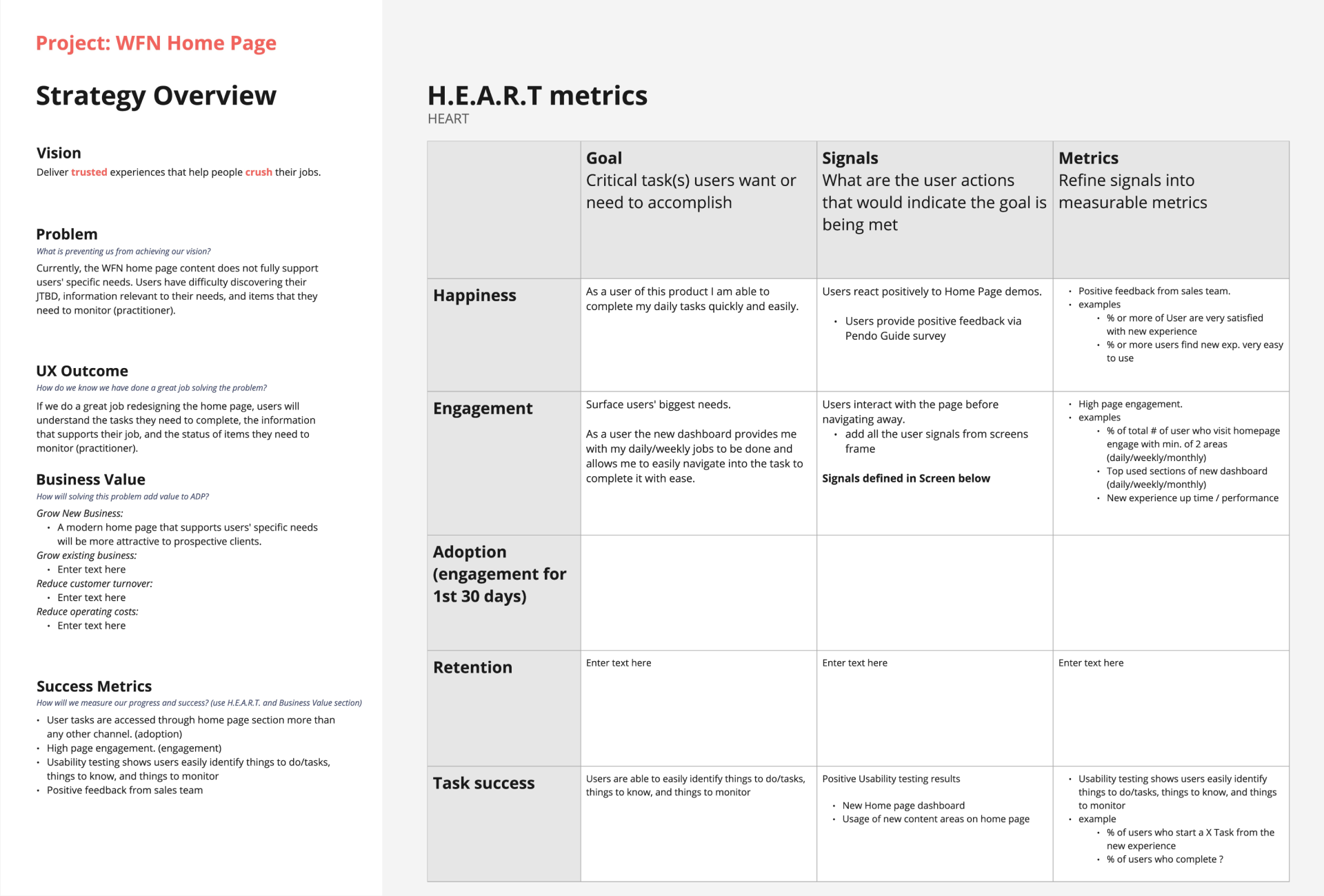
To ensure the project had a clear UX strategy, I focused on tying UX outcomes to business value and making UX impact measurable. Drawing from methods by Jared Spool and the Google design team, I facilitated a workshop to create a structured UX strategy. This workshop covered:
Defining the core problem we were solving.
Establishing desired UX outcomes that align with user needs.
Outlining how UX adds measurable value to the business.
Setting clear success metrics to evaluate the effectiveness of the UX impact.
This approach ensured the project had a focused, concrete strategy, balancing both user-centric and business priorities.
Outcome
To define a clear outcome, I focus on answering the question, “How will we know if we’ve done a great job?” For the home page redesign, our team developed this outcome statement:
"If we successfully redesign the home page, users will clearly understand the tasks they need to complete, the information that supports their work, and the status of items they need to monitor (for practitioners)."
This statement helped align the team around a shared vision of success, ensuring we stayed focused on user needs and measurable results.
Success metrics
Working toward a defined outcome is important, but it’s equally critical to establish clear, measurable metrics to track progress and ensure real value is being added. As a team, we asked, “What objective metrics can we use to evaluate how close we are to achieving our desired outcome?” Here's what we determined:
User behavior: More tasks are accessed through the home page sections than any other channel.
Engagement: High engagement rates on the home page.
Usability testing: Users consistently identify tasks, must-know information, and items to monitor with ease.
Support metrics: A decrease in support call volume related to home page issues.
Feedback: Positive feedback from the sales team on the redesigned home page.
These metrics provided a clear way to measure success and guide iterative improvements.
Design
I believe in a balanced team approach to design, often described as the “three-legged stool” of design, development, and product management. Just like a stool, if one of these legs is missing, the whole structure collapses. This approach emphasizes collaboration from the very beginning—concepts for requirements, designs, and technology are shaped simultaneously, with each discipline informing the others, ideally in a hands-on, collaborative setting like a whiteboard session.
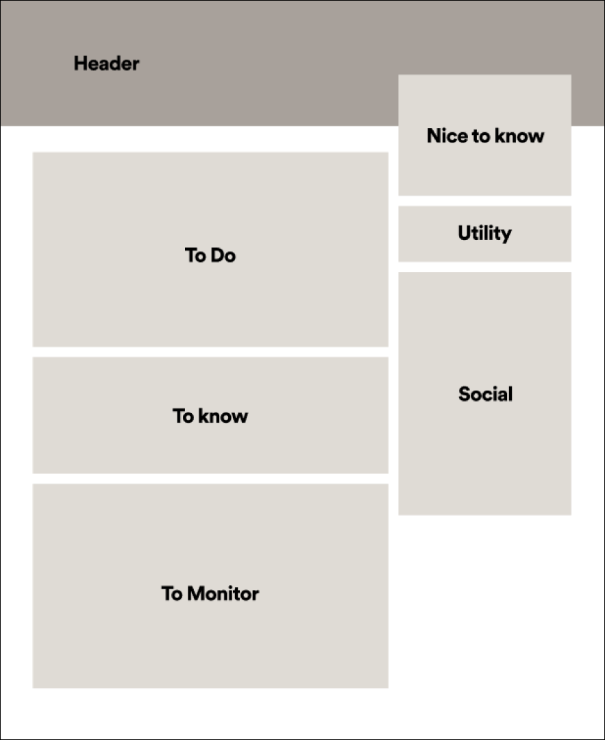
With a clear problem definition, agreed-upon solutions, and our UX strategy document in hand, I led a series of design workshops involving product managers, designers, and developers. Leveraging sketching and ideation techniques from the Stanford d.school, we developed a new home page template with a sharp focus on three key areas:
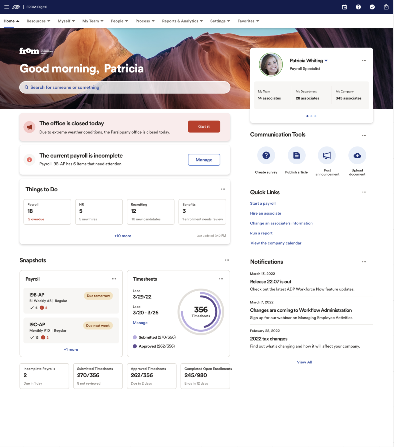
Things to Do: Highlighting important tasks users need to perform.
Things to Know: Providing relevant information tailored to the user.
Things to Monitor: Displaying meaningful data and metrics to track.
Additionally, the template incorporates:
Intelligent Personalization: Leveraging AI/ML to optimize relevance.
Templated Configurability: Offering adaptable templates that maintain usability and design standards.
Client Content Integration: Seamlessly supporting both ADP and third-party tools for client-specific needs.
This collaborative, cross-functional process ensured a well-rounded, user-centered outcome.
Iterations
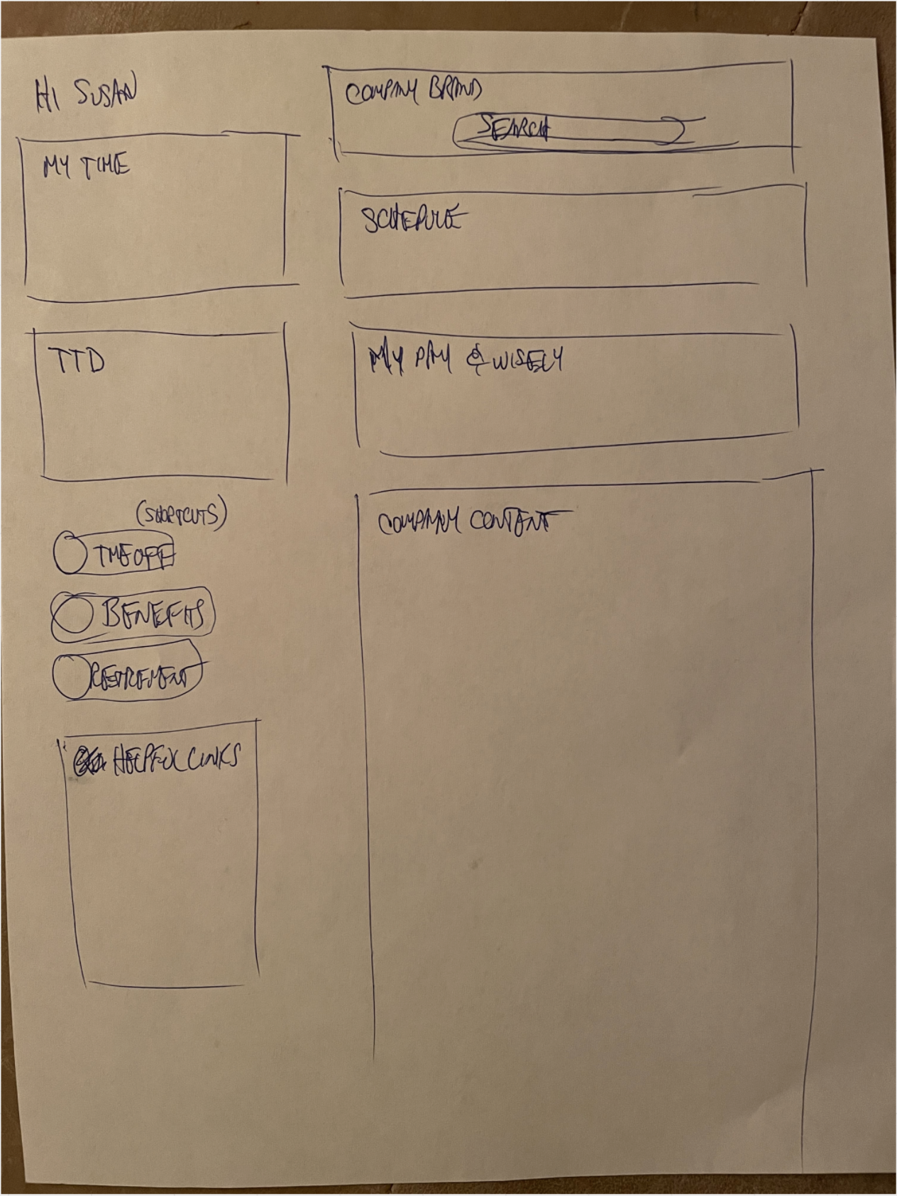
As a UX team, we rapidly iterated through designs, starting with quick sketches on paper and gradually refining them in Figma. At each stage, we gathered feedback from stakeholders and the broader product team to ensure alignment and improvement.
Once the designs began to solidify, our research team supported us in conducting guerrilla usability testing—a lightweight, efficient approach to gain insights quickly with minimal effort. Using single, static screens, we validated whether the content and features met user expectations and captured initial attitudinal reactions. This iterative process allowed us to refine our designs efficiently while staying closely aligned with user needs and stakeholder goals.
Usability Tests
Once our design reached a high-fidelity stage, we created an interactive prototype and conducted formal Usability Studies. Our test script focused on three key goals:
Identifying and completing high-priority tasks,
Recognizing critical information relevant to each user role, and
Locating role-specific data and taking action based on it.
The results were overwhelmingly positive: our design achieved 100% task completion, with every task rated as “very easy” by test participants. Additionally, users provided positive feedback on the look and feel of the new home page—without any prompting—reinforcing its intuitive design and user satisfaction.
Final Product
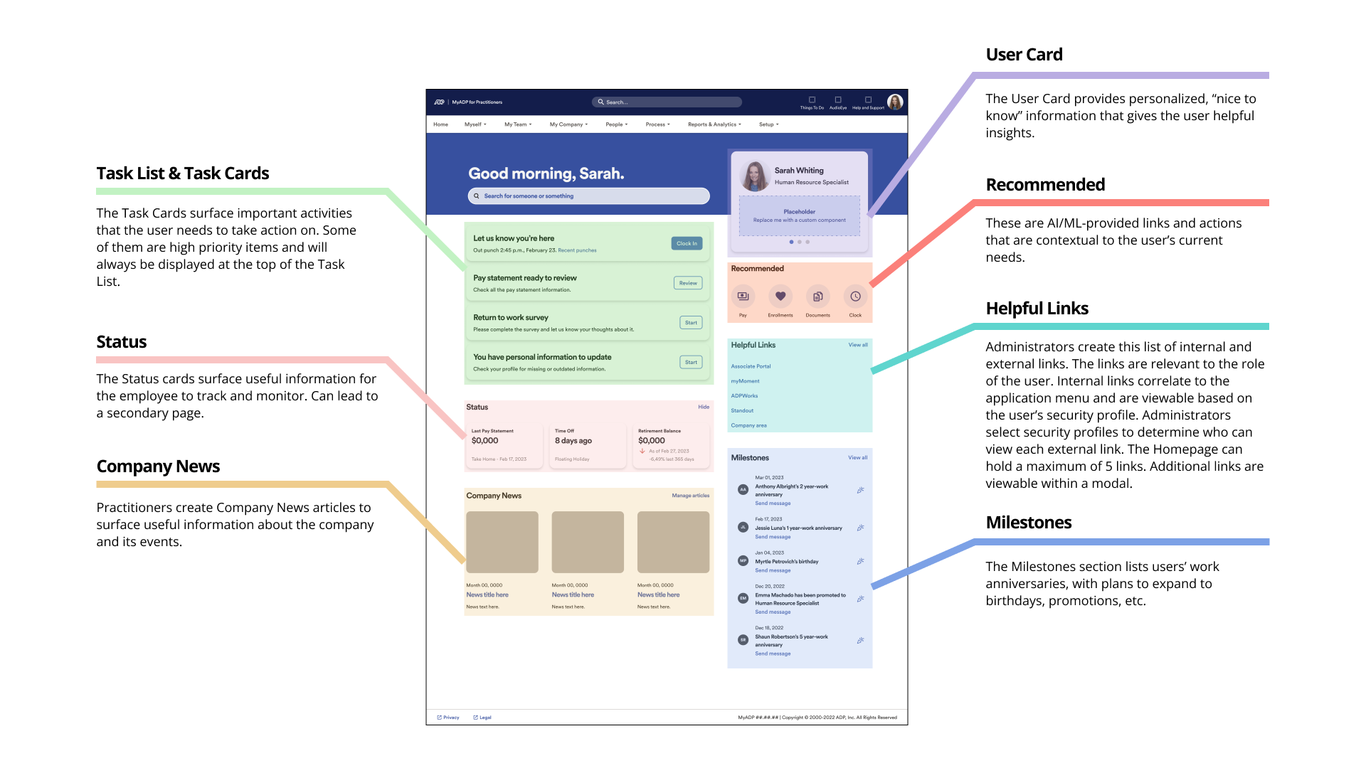
After months of design and development, we released the new home page template to a subset of customers. I believe that spending deliberate time upfront—what I call “spending time to save time”—makes the rest of the process significantly smoother. By doing our due diligence early, we built stakeholder consensus, stayed focused on the right solutions, and effectively balanced business and customer needs. The final design achieved all our outlined goals:
Improved visual and content hierarchy
Intelligent Personalization
Focused on:
Things To Do: Tasks and actions
Things To Monitor: Metrics, processes, and balances
Things To Know: News, alerts, and milestones
Configurability without full customization
Client Content Integration
This comprehensive approach ensured we delivered a solution that was both user-focused and business-driven.
Outcomes & Impact
Learnings and next iterations
We tracked our success metrics monthly after the new home page was released, and while results were mixed, we achieved significant progress.
Engagement: We aimed for users to complete more tasks through the home page task list instead of navigating deeper into the product. The results were strong—practitioners completed nearly 40% of their tasks through the home page, and employees used the home page for 90% of their tasks, marking a major success.
Usability Testing: Post-release usability tests mirrored our earlier results. Users were consistently able to identify tasks, must-know information, and items to monitor with ease.
Support Metrics: One of our key goals was reducing support call volume related to home page issues. Six months in, support calls related to home page dropped by over 65%.
Feedback: Sales teams reported overwhelmingly positive feedback when demoing the new home page to prospective customers. However, a subset of existing clients expressed frustration about the loss of full home page customization, often asking, “Why would you take functionality away?” Despite this, the improved look and feel received praise.
Overall, the data demonstrated strong outcomes, though the need to balance flexibility and user expectations remains a consideration moving forward.
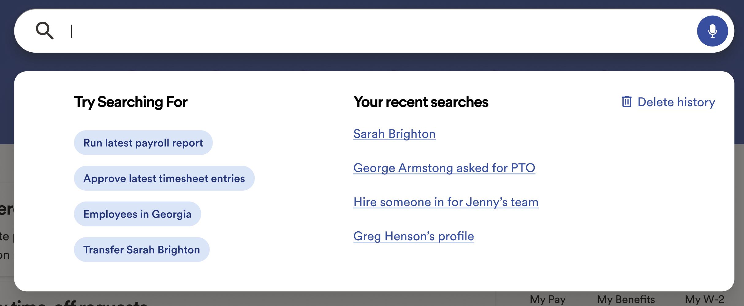
During the home page release, we encountered an unexpected but valuable insight: users were not using search. After further investigation, we found two key reasons: many users simply didn't notice the search bar, while others didn't trust search to be helpful for completing tasks.
This discovery sparked an entirely new initiative to redesign WFN's search functionality. Our focus was on creating a bigger, bolder design to combat banner blindness and improving search capabilities by enabling natural language input. This would allow users to search intuitively and complete tasks more efficiently.
