Search
I led the end-to-end redesign of the global search experience, starting with early concept development, design thinking workshops, pattern creation, usability testing, and ultimately delivery. This work involved aligning 10 domain teams around a shared vision, co-creating scalable design patterns, and validating solutions through multiple rounds of user testing.
Current search
WorkForce Now (WFN) is ADP’s largest and most complex platform, supporting a wide range of HR tasks across payroll, time, benefits, and more. Over time, its information architecture became deep, siloed, and difficult to navigate. Users often struggled to find what they needed—not because the content wasn’t there, but because it wasn’t easy to reach.
Search should have solved this, but it fell short. It was unreliable, often returned irrelevant results, and gave users no clear way to refine or take action. Many stopped using it altogether and turned to workarounds.
Rebuilding the platform’s structure wasn’t realistic. A smarter, more intuitive search experience offered a faster, lower-risk way to help users succeed.
On-Click
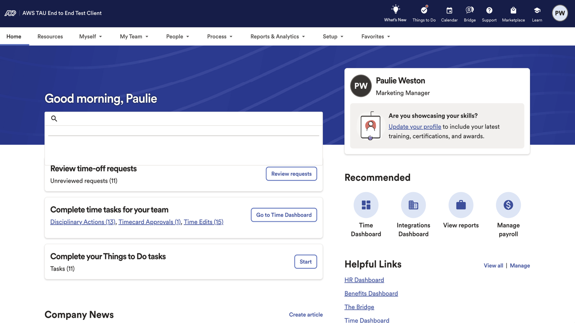
This was the existing on-click experience for search in WorkForce Now. Several design issues were immediately apparent. Visually, the search window aligned exactly with the "Things To Do" card behind it, causing the two elements to blend together. The low contrast made both the search box and its results difficult to distinguish from the background. Beyond visual design, there were also no prompts, guidance, or affordances to help users understand what actions they could take or what types of content were searchable.
Employee Search
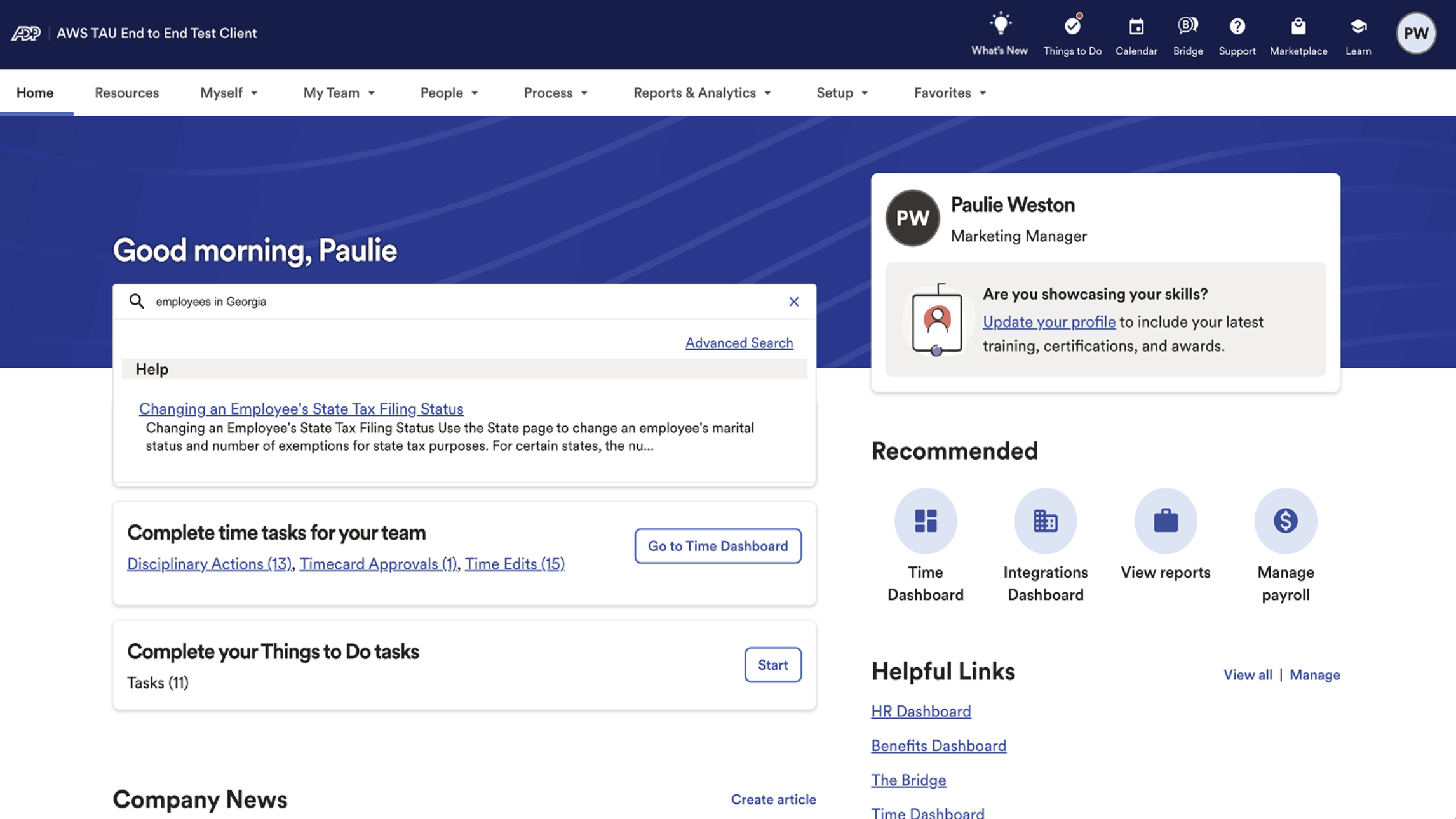
The problems became more significant once a user began typing a search query. Imagine a typical HR practitioner trying to complete a common task, such as finding a list of employees in a specific location. When searching for “Employees in Georgia,” the system returned completely unrelated results. In this case, the only result shown was a help article titled Changing an Employee’s State Tax Filing Status, which had no relevance to the user’s intent. This lack of meaningful results reduced trust in the system and created unnecessary friction for users trying to complete essential tasks.


Understand & Define
What is preventing us for achieving our vision?
WFN search does not support critical jobs to be done. Users have to navigate through a complex and difficult to learn IA to complete tasks, leading to frequent support calls and low customer satisfaction.
Outcome
Success Metrics
How do we know we have done a great job?
If we do a great job, users will use search first to confidently and efficiently complete tasks, answer questions, and navigate to a page.
How will we measure our progress and success?
Users take actions on lists of people in search window
Reports are generated in search window
Decrease in time to run a report
High task completion and confidence seen in usability tests
Decrease in time to complete bulk actions on a list of people
Feature is easily discoverable
Positive feature retention
Decrease in call volume
The next step was a “How Might We” workshop with the same group of stakeholders. Everyone was given a pad of sticky notes and asked to spend 10 minutes writing as many questions as possible in the format of “How might we…” Each question was meant to generate ideas that could help us achieve our previously defined outcome. After 10 minutes, we posted all the notes on the wall, grouped them, and identified patterns. Four major themes emerged—two focused on technical challenges and two on user experience:
How might we support major Jobs To Be Done through search?
How might we help users complete critical tasks faster?
How might we support natural language in search?
How might we return relevant and accurate results?
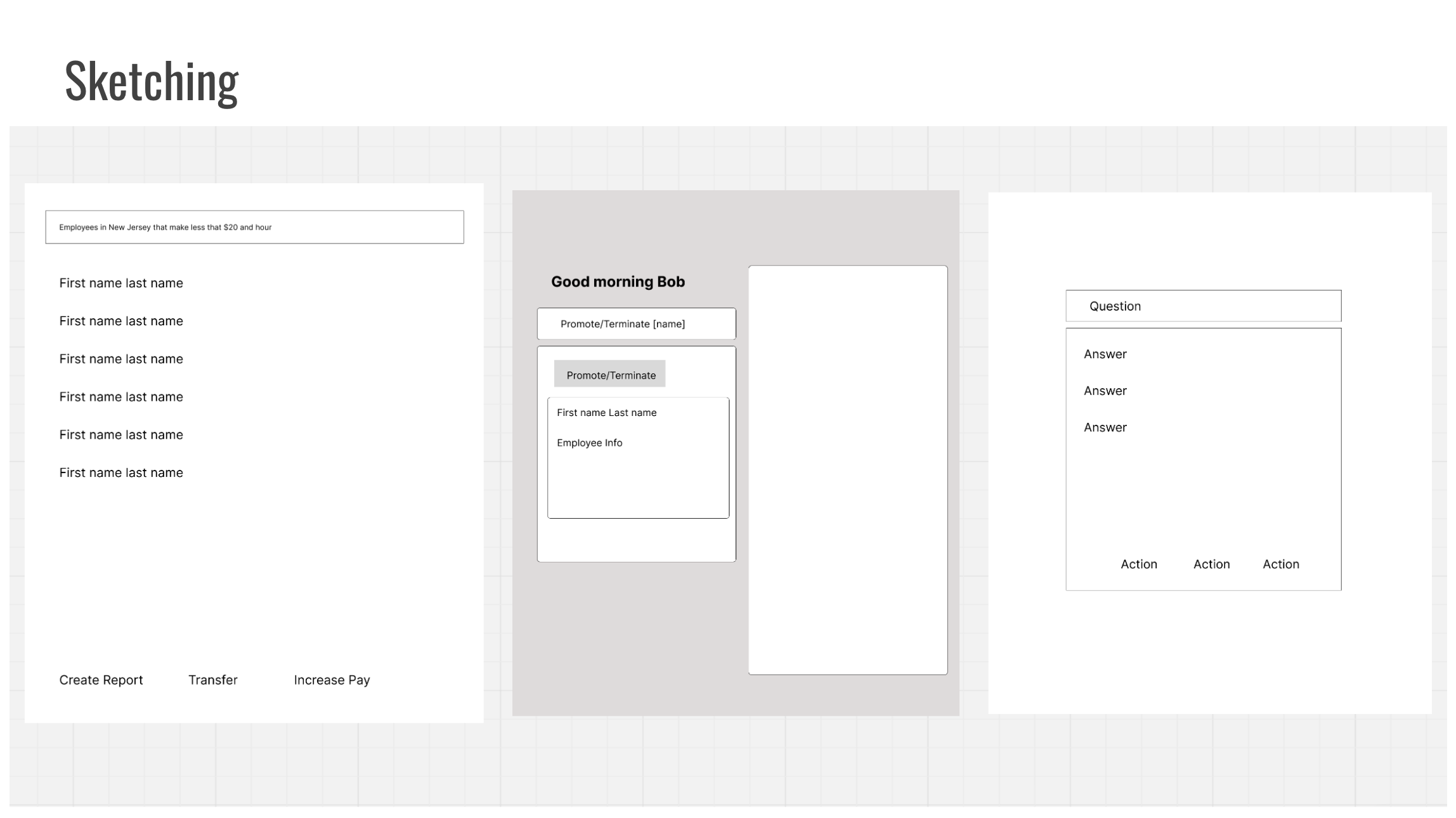
With our focus areas defined, I led a sketching exercise to generate potential solutions. Similar to the “How Might We” activity, each participant had 10 minutes to create as many sketches as possible that addressed our top opportunity areas. After time was up, we shared the sketches as a group, then organized and categorized them to find patterns.
Three concepts stood out as the most promising:
The first sketch shows a semantic people search that returns a specific group of employees and allows the user to take action directly from the search window.
The second sketch illustrates an action being typed into the search field, with relevant information and calls to action appearing immediately in the results area.
The third sketch depicts a user typing a common question that they might otherwise search in Google. In this case, WFN returns helpful results and related actions within the platform.
These early concepts helped shape the direction for our first round of design explorations and usability testing.
With a clearly defined problem, outcome, and success metrics, along with broad design concepts collaboratively developed with key stakeholders, I began documenting the major Jobs To Be Done across all user groups. I met with all 10 domain teams to capture the critical JTBD that could be supported through search. As with the earlier exercises, I grouped and categorized these jobs. Using this prioritized list of JTBD alongside the concepts from our workshops, I then moved into the design phase.
As a first step in redesigning the search experience, I brought together a group of high-level stakeholders to define the problem we were solving, the outcome we wanted to achieve, and the success metrics we would use to measure impact. This method, largely inspired by Jared Spool’s work, has consistently been one of the most effective ways I’ve found to align teams early and build shared ownership of the design direction.
Problem
HMW notes and Sketching
JTBD
Design
Default and On-click
The design phase for this project was different from most. Typically, we create prototypes to conduct usability testing before development builds the feature. However, we determined that search is too complex and requires too much flexibility to build an adequate prototype. Our approach was to iterate through designs using static images with minimal testing, then build a working proof of concept to conduct thorough usability testing. While there was a risk that some parts of search might need redesign after coding began, all stakeholders felt confident that the potential benefits outweighed the risks.
The default and on-click search states were completely redesigned. The search bar was made much wider and deliberately not aligned with other screen elements to improve its visibility. It also includes helper text to guide users on what they can search for.
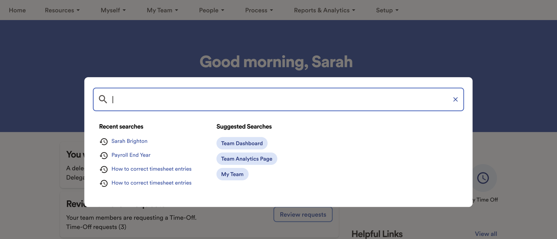
The on-click state uses a light box design that focuses the user on the search window while keeping the context of the page they were on. It displays recent searches and, more importantly, uses machine learning to intelligently suggest searches based on the user’s role, time of year, and other contextual factors.
Results
This redesign showed how search can serve as more than just a navigation tool. Ultimately, we created a hybrid search experience—combining the intelligence of ChatGPT-style interaction with the broad coverage of Google-like results. This system returns not only actionable results but also relevant navigation and reference content, all within a single interface. By focusing on real user needs and testing throughout the process, we delivered a solution that felt both powerful and intuitive. The following metrics from our beta release highlight the impact of this work.


This is what we call our “Tim” search. It is a generic search that returns results across all our search categories: people, pages, help, and reports. This represents our default, broad search state. Users can narrow the search window to focus on just one of these categories. Additionally, within the people section, there is a menu that allows users to quickly perform common actions such as transferring, terminating, or updating information for a person.
Supported JTBD
Find information
Employees
Help topics
Reports
Take an action on a person
Pay Tim a bonus
Reassign Tim
Promote Tim
Navigate to a page
Time
Employee profile
My Benefits
“Tim” Search
The next pattern enables users to perform a semantic people search that returns filtered results. It also provides calls to action for bulk actions on selected employees.
Semantic Search
Supported JTBD
Take an action on a group
Run a report
Transfer
Give everyone a raise
Send a reminder
Take an action on a person
Pay Tim a bonus
Reassign Tim
Promote Tim
Look up information on a person
Find Tim’s title
Find Tims’s address
Find Tim’s phone number
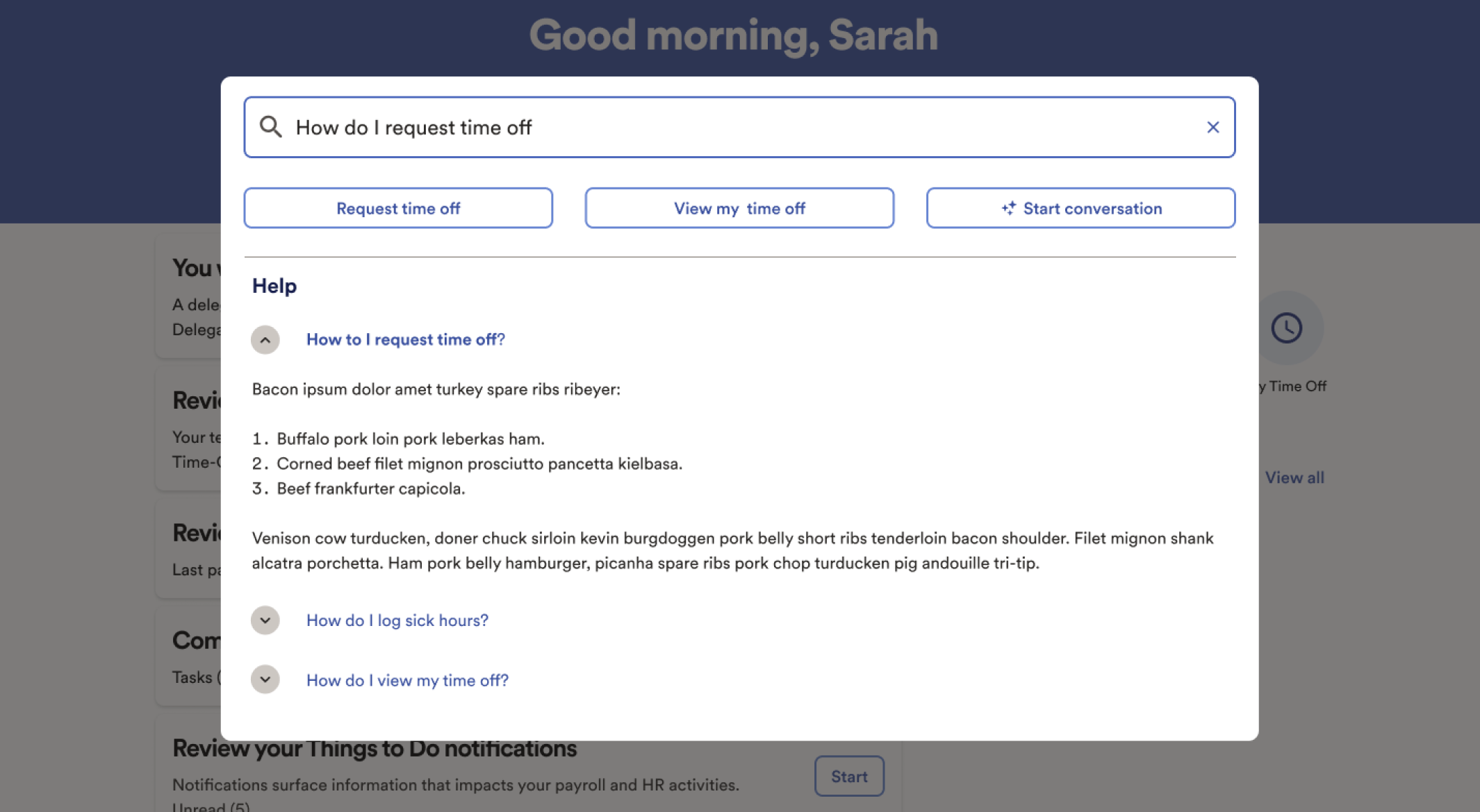
The “How Do I” plus Actions pattern supports natural language searches. It returns relevant help articles and calls to action related to the user’s query.
How Do I + Actions
Supported JTBD
Learn about a Topic
How to take time off
How to enroll in benefits
How to promote an employee
Take an action
Take time off
Enroll in benefits
Promote an employee
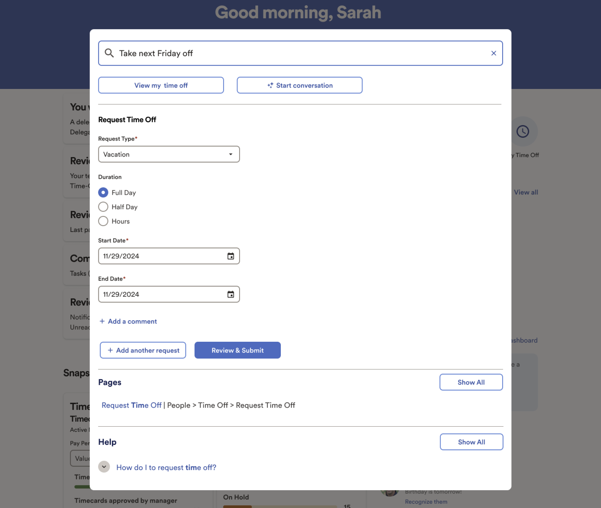
The Simple Actions pattern lets users perform common tasks directly from the search window. For example, if a user types “Take next Friday off,” the system automatically pulls the input fields from the PTO page, intelligently fills them out, and allows the user to submit the request right from the search window.
Simple Actions
Supported JTBD
Take an action
Take time off
Submit time
Promote someone
Navigate to a page
Time
Employee profile
My Benefits
Learn about a Topic
How to take time off
How to enroll in benefits
How to promote an employee
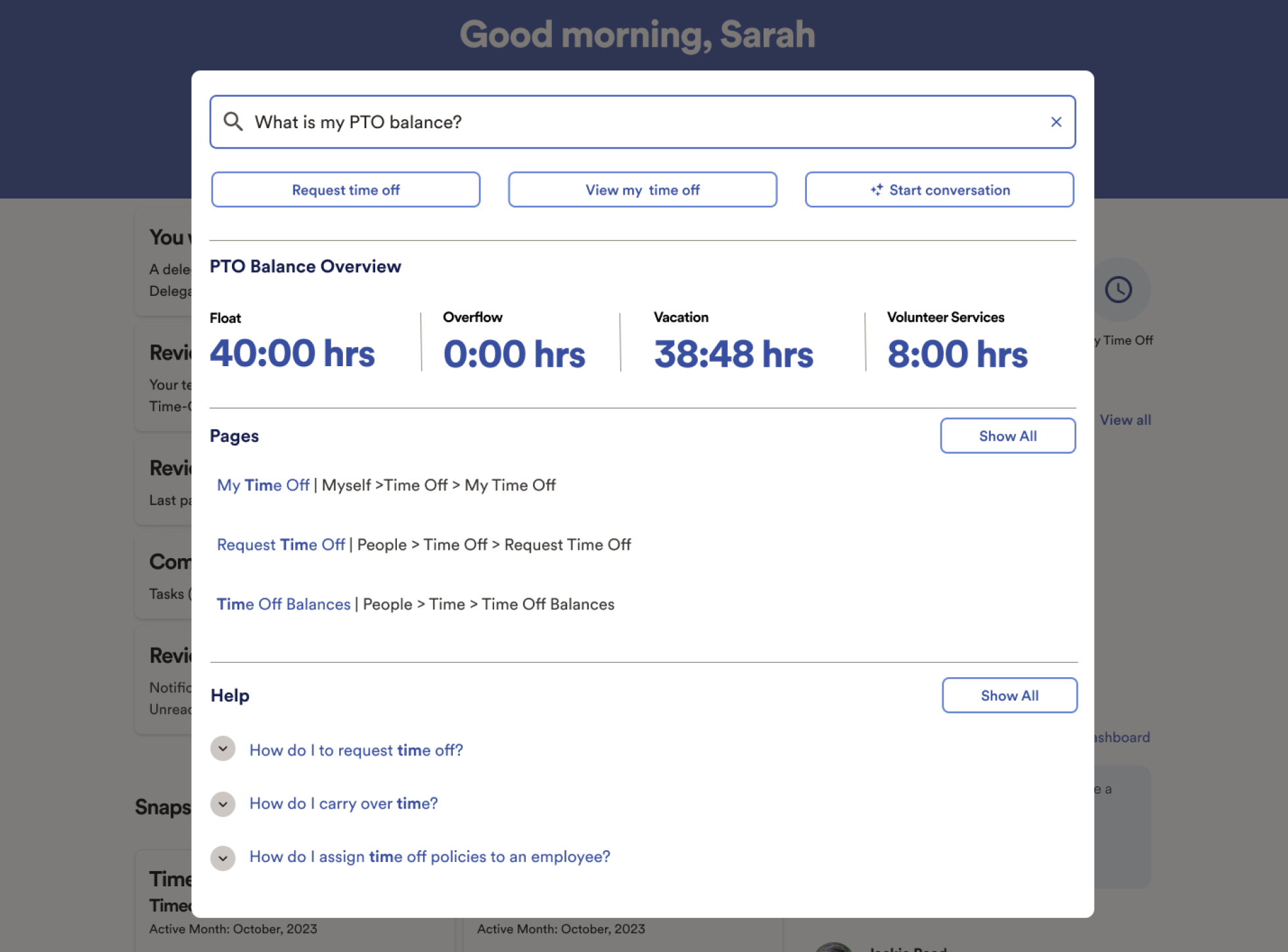
The Quick Stats pattern displays simple metrics in response to common queries such as PTO balance, weekly hours, and compensation. It also surfaces relevant actions, links, and help articles to support the user’s next step.
Quick Stat
Supported JTBD
Find “simple” data
PTO balance
401k balance
Compensation
Take an action
Take time off
Submit time
Promote someone
Navigate to a page
Time
Employee profile
My Benefits
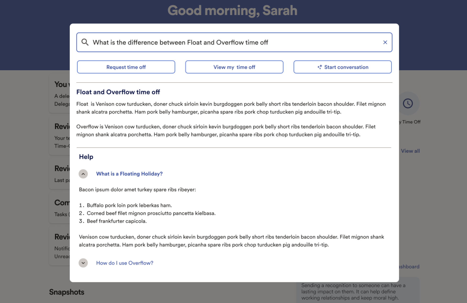
During our research, we discovered that users often left the product to search Google for definitions of terms they did not understand. Although this information already exists within WFN’s help content, it was not easy to find. To solve this, we designed a pattern that detects when a user’s query is asking for a definition. The system then pulls the relevant information from help content and surfaces it directly in the search window, along with related links and calls to action.
What’s the difference
Supported JTBD
Understand complex information
What’s the difference between annual maximum and annual deductible
What’s the difference between Float and Overflow
Take an action
Take time off
Submit time
Promote someone